UX Design for Humans #2
Welcome back, dearest reader.
Last time we detailed everything we could about UI/UX design. Today, we’ll try to find the perfect balance between design and functionality in modern applications.
It’s a rather common misconception to think that Design and Functionality are to be thought of separately during application development, when in fact, they go hand in hand, and we’ll discover that today.
Application Design
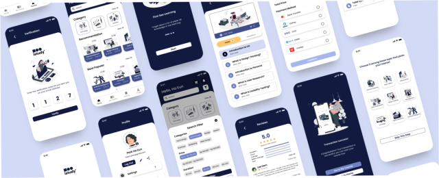
Application design is where you get to combine UI and UX design and make the coolest-looking app possible, but you should be careful that your app design doesn’t come at the expense of the app functionality.
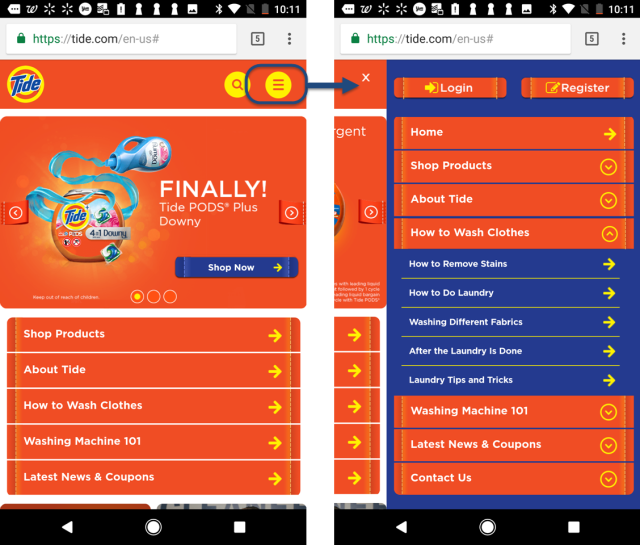
Apps should always be designed to accommodate the user. For example, an app menu should be designed in a way that is easy for your users to navigate and access the most important features, too many distractions and a complex design wouldn’t be ideal for user satisfaction. Too many choices can be a source of distraction for users and might prevent them from finding the essential information.
Crowded menu
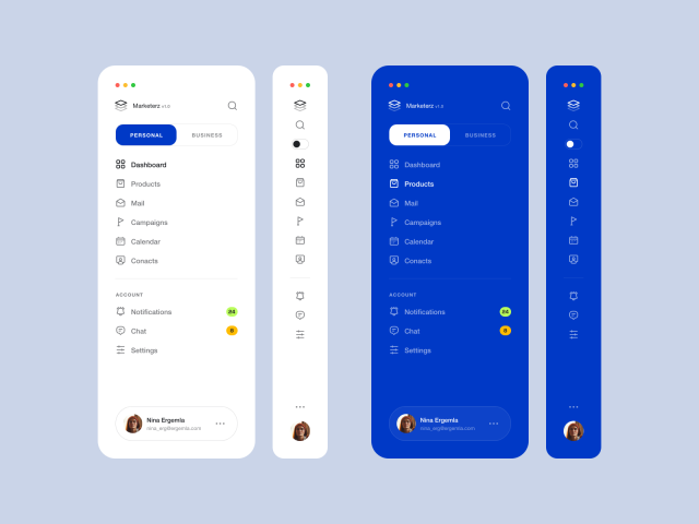
A simple menu filled with essentials
This is why some designers will aim for minimalism, opting for a sleek design with plenty of white space. However, this can cause relevant information to be missing.
Google’s homepage is an example of how minimalism can work. The site’s design is simple, input a query into the search bar to find what you need – and this is exactly what it does. Nothing more and nothing less, everything relevant is already on there, fulfilling its purpose.
An interesting pattern observed is that applications with superior graphics that had creative implications on the app in some capacity, top the application stores regularly, which, in turn, boosts the app’s functionality as well. This is why the developers should make an effort to make sure that the user’s visual perception is as enhanced as possible.
Application Functionality
Functionality refers to whether a design works and helps the users meet their goals and needs.
When a new user launches an app, they form an opinion immediately. Is it easy to use? Is it visually appealing? Does it perform all the functions I need it to? The average user doesn’t want to spend more than 10 minutes figuring out how to use an app. The simpler that your app functions, the more loyal your user will be. Mindlessly increasing the interactivity of an app will damage the user experience instead of improving it.
To select appropriate App functionalities, you have to think like your user; For example, with a social media app, users encounter a login screen. From this page, existing users can log in and access a newsfeed-type page, while new users will be prompted to enter their information and configure their accounts. Once existing users have reached their newsfeed, they’ll want to access a private messaging interface and an area to post text, images, videos, and links. etc.
Design vs. Function

With new graphic technologies and more advanced coding coming to light, designers are realising that design should complement functionality, not contrast it.
Let’s envision a good website and review how design and functionality commend each other. When you click on the link, the page loads fast (functionality). The title at the top of the page shows you where you are (functionality). After the page has loaded, the first thing you see is the colours of the page (design). They work together, directing the eye to the most important pieces of content (design). The second thing you notice is the menu bar. The design lets the menu bar stand out; it is easy to find (design). The menu is each to read and the titles of the links don’t leave you guessing which page they lead to (functionality). The page itself is divided up into sections, making the content easy to distinguish, read, and understand (design).
So, to summarise there’s hardly any competition between the two. Most people think that design and functionality work against each other when that’s hardly even the case. It’s much more than that, a good app has to balance out its design and functionality because both of them are important factors in the success of your app and your user satisfaction, whatever its main function is, it has to prioritise its user above all else.


